What is a wug-shaped curve
and why is it of interest?
The wug-shaped curve depicts a frequency pattern widely found in
quantitative studies of variable phenomena in linguistics. Indeed, it is
so widespread that I believe its appearance may be meaningful from a
theoretical viewpoint. Visually, the wug-shaped curve takes the form of two or more identical sigmoid (logistic)
curves, spaced apart.
The wug-shaped curve is a natural consequence of probabilistic
versions of Harmonic grammar, such as MaxEnt.
Here is how the analysis is set up: we divide the constraint set
into two families, having different forms or teleologies: Baseline
constraints and Perturbers. We then plot the empirical data points,
in the form of probabilities (zero to one) on the vertical axis,
and Baseline probability on the horizontal axis. This is done
separately, in a different color, for the data series defined by
violations of the Perturber constraints. We also plot the sigmoid lines
themselves, which show the model fit -- ideally, the data points will
cling to their respective sigmoids.
Here is the underlying research agenda: along with some of my colleagues, I
suspect
that MaxEnt, or something like it, is correct for natural language, and
that is why wug-shaped are ubiquitous in language data. You can judge for
yourself by browsing through the images in this gallery, or by analyzing
your own data in this way (see the last section for how).
Various people see various things in multiple sigmoids. It was Dustin
Bowers who suggested to me that they look like wugs. The wug was invented
and first drawn in 1958 by Jean
Berko Gleason, in one of the most famous
papers ever written in linguistics. In recent years, the wug has
been adopted by the field of linguistics as a sort of mascot. The real
wug is cuter than the mathematical one.
What is this web page
for?
I've written an article about wug-shaped curves in linguistics, which you
can download from the links at the top of this
page, in either a long or short version. Even the long version
doesn't have all of the cases I've compiled, and it seems that a web site
would be the best format to display them all together, perhaps adding more
in the future. Below, I've included all
the cases I have studied, including the ones where the data don't
look entirely pretty.
Browsing hints
For the scholarly reference sources behind all these curves, please
follow the links or look at the bibliography section of my paper.
In most cases, a link to a spreadsheet is included, which will tell you
how I obtained the data, did the MaxEnt reanalysis, and plotted the curve.
For a few cases, my spreadsheet is still messy and can't be shared yet,
though you could ask.
Sources: Hayes
and Londe (2006), Hayes
et al. (2009), Zuraw
and Hayes (2017)
Y-axis: how often a stem will take back suffixes in a wug-test
experiment
Baseline constraints: based on stem vowels that influence harmony; B
is any back vowel, F any front rounded vowel.
Perturber constraints: stem-final consonant environments (e.g.,
after sibilants) that favor front harmony
Spreadsheet (forthcoming), plotting
script
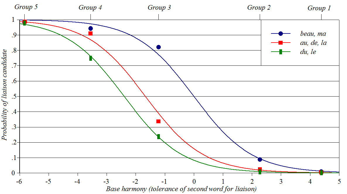
French liaison
Source: Zuraw
and Hayes (2017)
Y-axis: likelihood of elision or liaison; for example, use of [l]
instead of [la] for the feminine definite article
Baseline constraints: lexical propensity of Word 2 to act as an
h-aspiré word
Perturber constraints: lexical propensity of Word 1 to appear in its
isolation form Spreadsheet, plotting
script
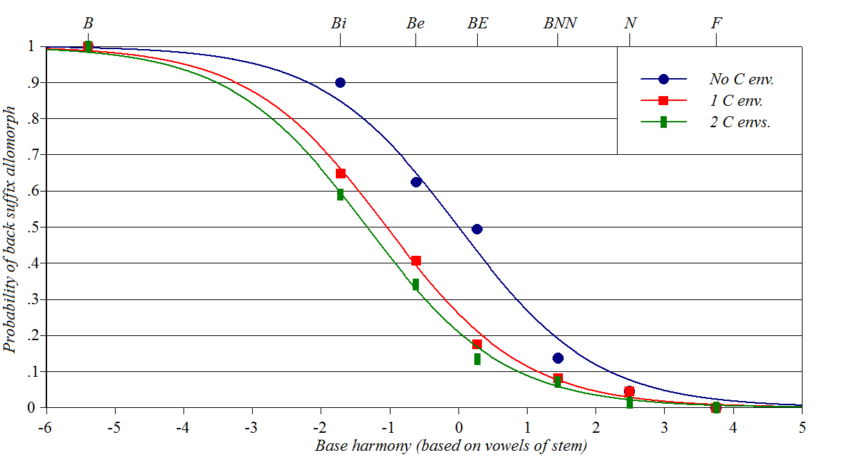
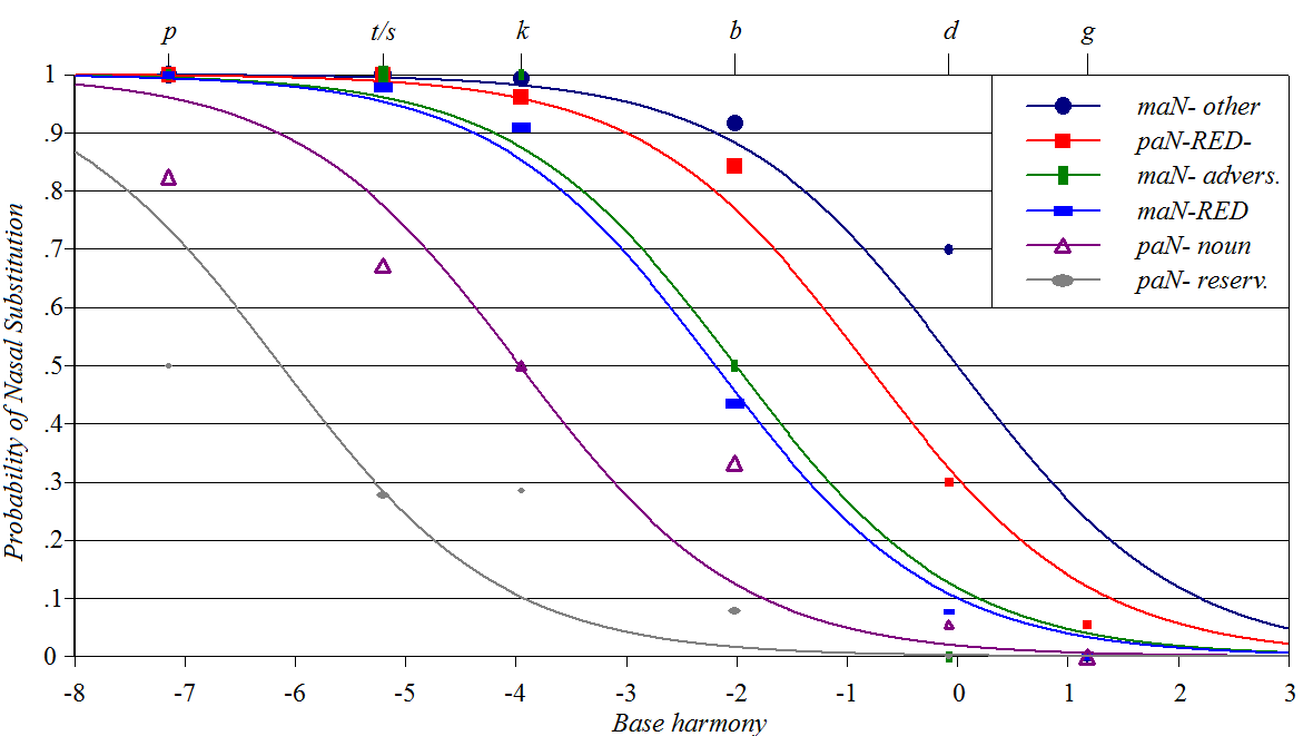
Tagalog Nasal
Substitution
Sources: Zuraw (2000,
2010), Zuraw
and Hayes (2017)
Y-axis: how often a stem of a given type will undergo the process of
Nasal Substitution
Baseline constraints: related to place and manner of stem-initial
consonant
Perturber constraints: propensity of a particular prefix to trigger
the process Spreadsheet, plotting
script
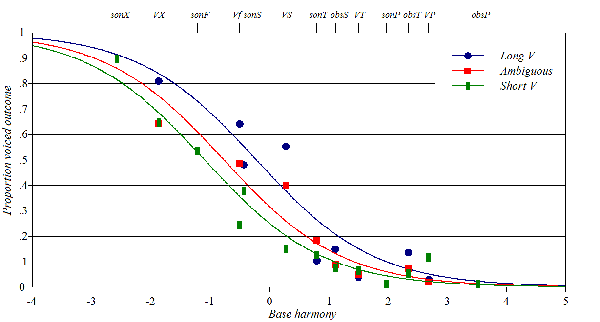
Inversion of Final
Devoicing in Dutch
Source: Ernestus
and Baayen (2003)
Y-axis: how often speakers guess that a stem-final obstruent (always
voiceless when word-final) will appear as voiced when suffixed
Baseline constraints: place and manner of stem final consonants,
preceding consonant if any
Perturber constraints: based on three degrees of vowel length in the
stem
Spreadsheet (forthcoming), plotting
script
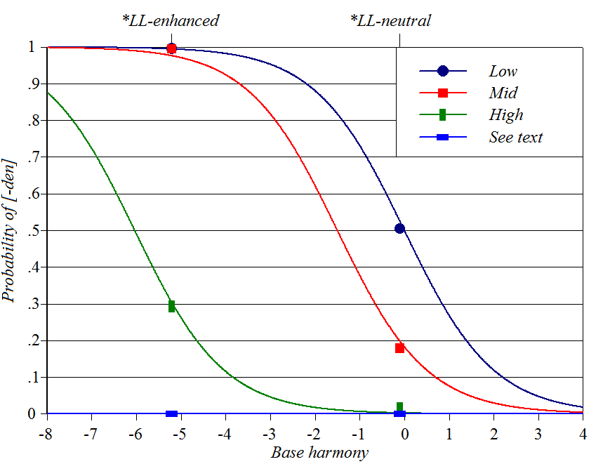
Finnish genitive plurals
Sources: Anttila (1997), Boersma
and Hayes (2001), Goldwater
and Johnson (2003), Hayes
(in progress)
Y-axis: how often a stem will take the longer [-den] allomorph of
the genitive plural
Baseline constraint: whether allomorph choice will result in two
consecutive light syllables
Perturber constraints: based on vowel height and weight of stem
syllables. One perturber is inviolable (infinite weight) and
therefore produces a flat line, not a sigmoid. Spreadsheet,
plotting script
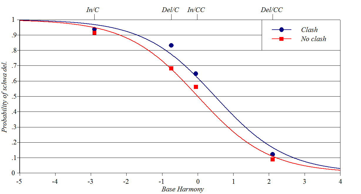
Schwa/zero alternations
in French: Smith/Pater
Source: Smith
and Pater (2020)
Y-axis: how often zero shows up in French schwa/zero
alternations
Baseline constraints: whether schwa is inserted or deleted,
consonants in environment
Perturber constraint: whether deletion of a schwa creates clashing
(adjacent) stressed syllables Spreadsheet, plotting
script
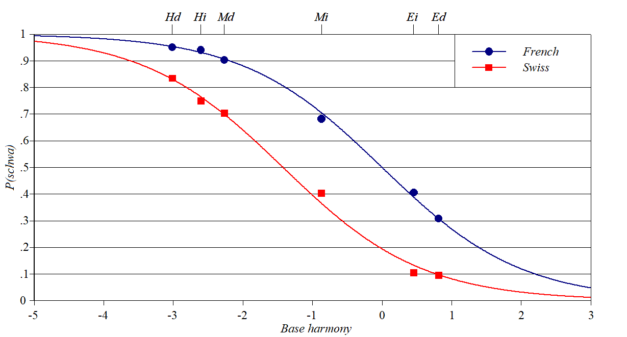
Schwa/zero alternations
in French: Storme
Source: Storme
(2021)
Y-axis: how often zero shows up in French schwa/zero
alternations
Baseline constraints: the markedness of the cluster into which schwa
is inserted (Hard, Medium, Easy), whether morphology is derivational or
inflectional.
Perturber constraint: a difference between Swiss and French native
speakers, treated by Storme as stricter Dep(schwa) in the Swiss dialect.
Thanks to Benjamin Storme for help with these data.
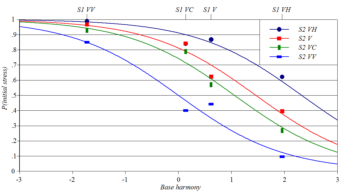
Source: Ryan
(2019)
Y-axis: probability of initial stress rather than second syllable
stress
Baseline constraints: weight of initial syllable
Perturber constraints: weight of second syllable Spreadsheet, plotting
script
Wug-shaped
curves in phonetics
Perception of voicing
based on closure duration and length of preceding vowel
Source: Kluender
et al. (1988)
Y-axis: likelihood an experimental participant will perceive a
voiced instead of a voiceless stop
Baseline constraint: gradient, based on closure duration
Perturber constraint: long vs. short preceding vowel Spreadsheet, plotting
script
Perception
of liquids based on F3 and phonotactic constraints
Source: Massaro
and Cohen (1983)
Y-axis: likelihood that an experimental participant will perceive
[r] as opposed to [l]
Baseline constraints: F3 value of a synthesized liquid consonant
Perturber constraints: violation of various phonotactic constraints,
based on choice of preceding consonant (*[tl, *[sr, ?[vl, ??[vr) Spreadsheet, plotting script
Wug-shaped
curves in syntax
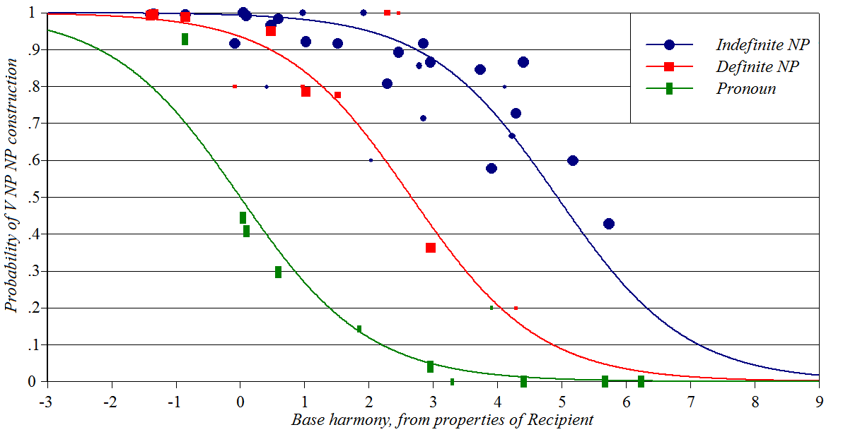
Datives in English
Source: Szmrecsanyi
et al. (2017)
Y-axis: how often the meaning of the dative construction will be
expressed using NP NP rather
than NP to NP
Baseline constraints: governing various properties of the Recipient
Perturber constraints: status of the Theme
Spreadsheet (forthcoming), plotting
script
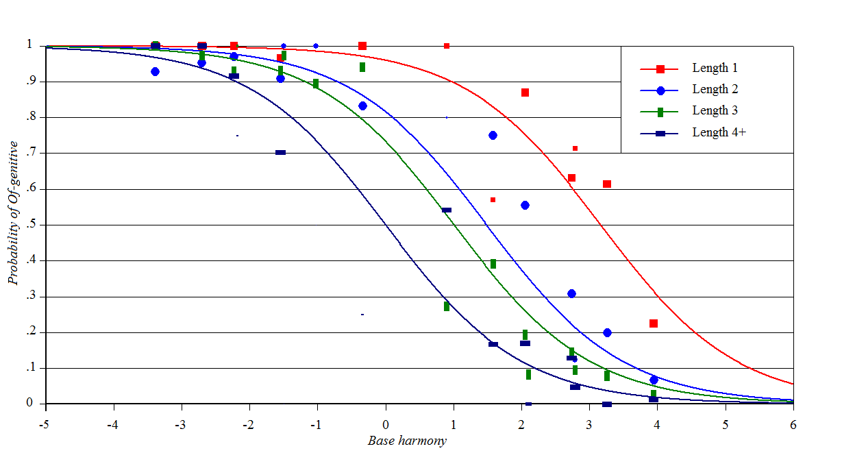
Genitives in English
Source: Szmrecsanyi
et al. (2017)
Y-axis: how often the meaning of the possessive will be
expressed using NP's NP rather
than NP of NP
Baseline constraints: an amalgam; consult the Szmerecsanyi et al.
paper
Perturber constraints: based on length of possessor in words
Spreadsheet (forthcoming), plotting
script
One can also plot the same data with length as the Perturber, like this:
Wug-shaped
curves in sociolinguistics
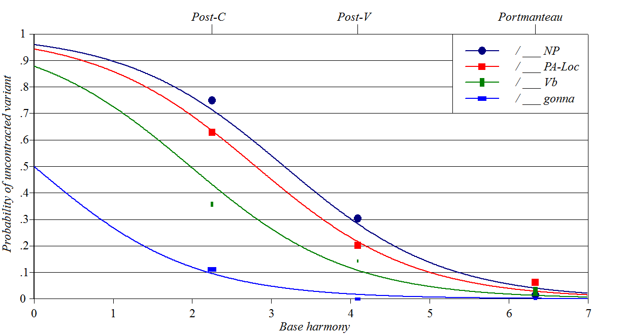
Contraction of the copula
in Black English
Sources: Labov
(1969), Cedergren
and Sankoff (1974)
Y-axis: how often the speaker uses a contracted (vowelless)
allomorph of the copula
Baseline constraints: left side environment, including pronominal
portmanteaux like he's
Perturber constraints: right side syntactic environment
This case is unusual in my experience in that the data are fitted solely
by the "tail" of the wug; cases further forward on the wug are empirically
missing. Spreadsheet, plotting
script
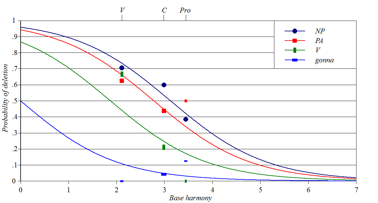
Deletion of the copula in Black English
Sources: Labov
(1969), Cedergren
and Sankoff (1974)
Y-axis: how often the speaker uses a null allomorph of
the copula, assuming they have already chosen to contract.
Baseline constraints: left side environment, include pronominal
portmanteaux like he's
Perturber constraints: right side syntactic environment
Spreadsheet, plotting
script
This is perhaps the messiest case I have seen; perhaps the use of
conditional probability is the problem?
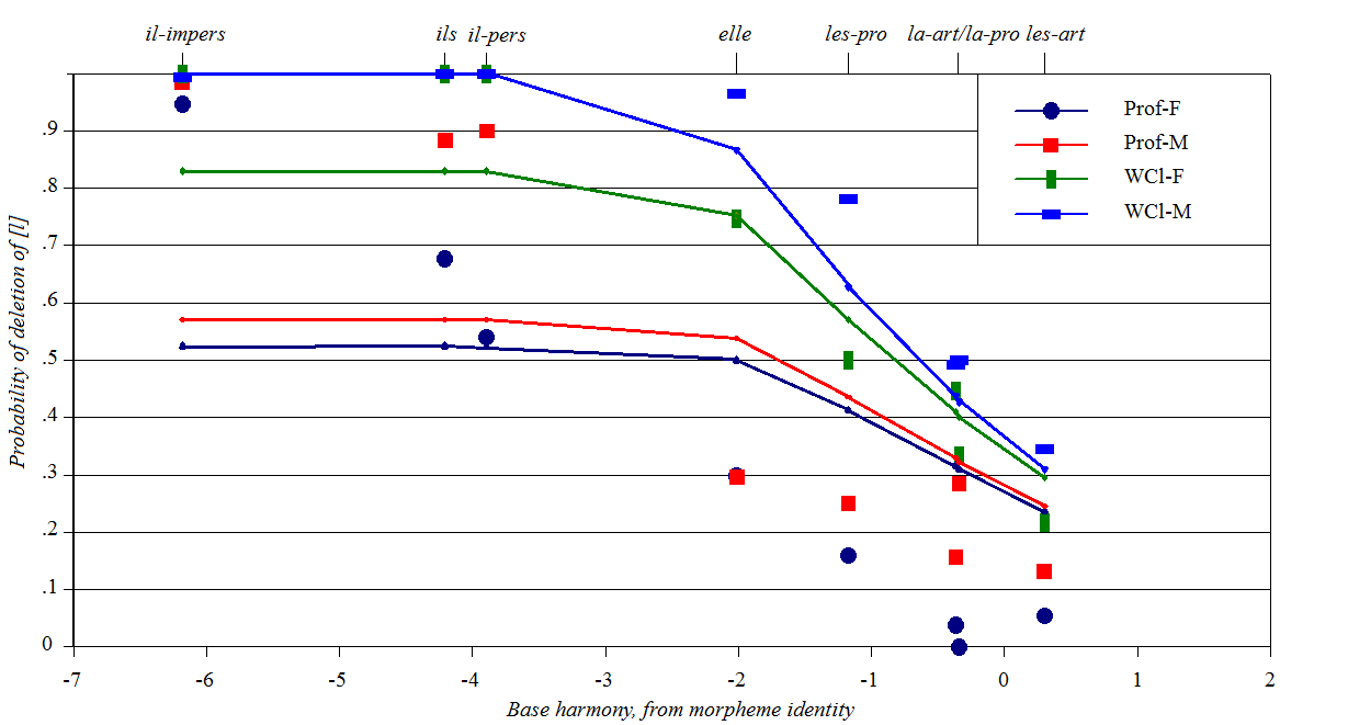
Deletion of [l] in Quebec
French
Source: G. Sankoff (1972), cited and discussed in Bailey
(1973)
Y-axis: deletion rate of [l]
Baseline constraints: varying propensity of various function words
to lose their [l]
Perturber constraints: sex and social class of speaker, taken as a
proxy for Max(l) varying by speaking style Spreadsheet, plotting
script
This case stands out as problematic for Stochastic OT, critiqued in
Zuraw
and Hayes (2017) and my own paper.
Here is a graph of a best-fit model of these data in Stochastic OT:
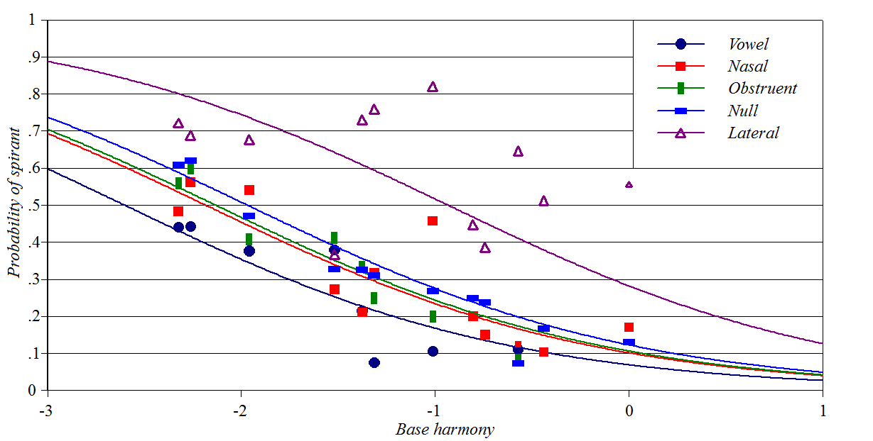
Source: Cedergren
and Sankoff (1974)
Y-axis: probability of realizing /r/ as a spirant
Baseline constraints: phrasal position, whether /r/ is part of the
infinitive ending, speaking style
Perturber constraints: following segment
This is a rather messy one, I admit, and in particular lacks extreme
values of probability. Spreadsheet, plotting
script
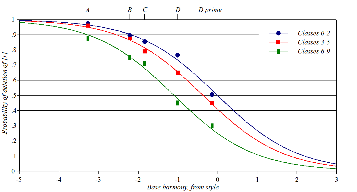
R-Dropping in New York
City English
Source: William Labov, via Cedergren
and Sankoff (1974)
Y-axis: probability of deleting /r/ in syllable codas
Baseline constraints: speaking context
Perturber constraints: designating different dialects spoken in the
same speech community. Spreadsheet, plotting
script
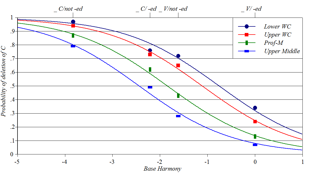
Cluster Simplification
in Detroit Black English
Source: Wolfram
(1969)
Y-axis: probability of deleting one of a pair of adjacent consonants
Baseline constraints: neighboring vowel/consonant, whether deleting
consonant is part of past tense suffix
Perturber constraints: social class, assumed to be a proxy for
speaking style
This curve has a puzzling too-close vertical grouping for the _ C/ -ed
case. Spreadsheet,
plotting script
Wug-shaped
curves in language change
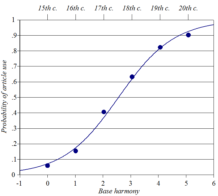
Portuguese definite
articles
Source: Kroch
(1989), ultimately from Oliveira y Silva (1982)
Y-axis: probability of use of a definite article when a NP also has an NP
possessor
Baseline constraints: rising constraint preferring this usage, over
centuries
No perturber
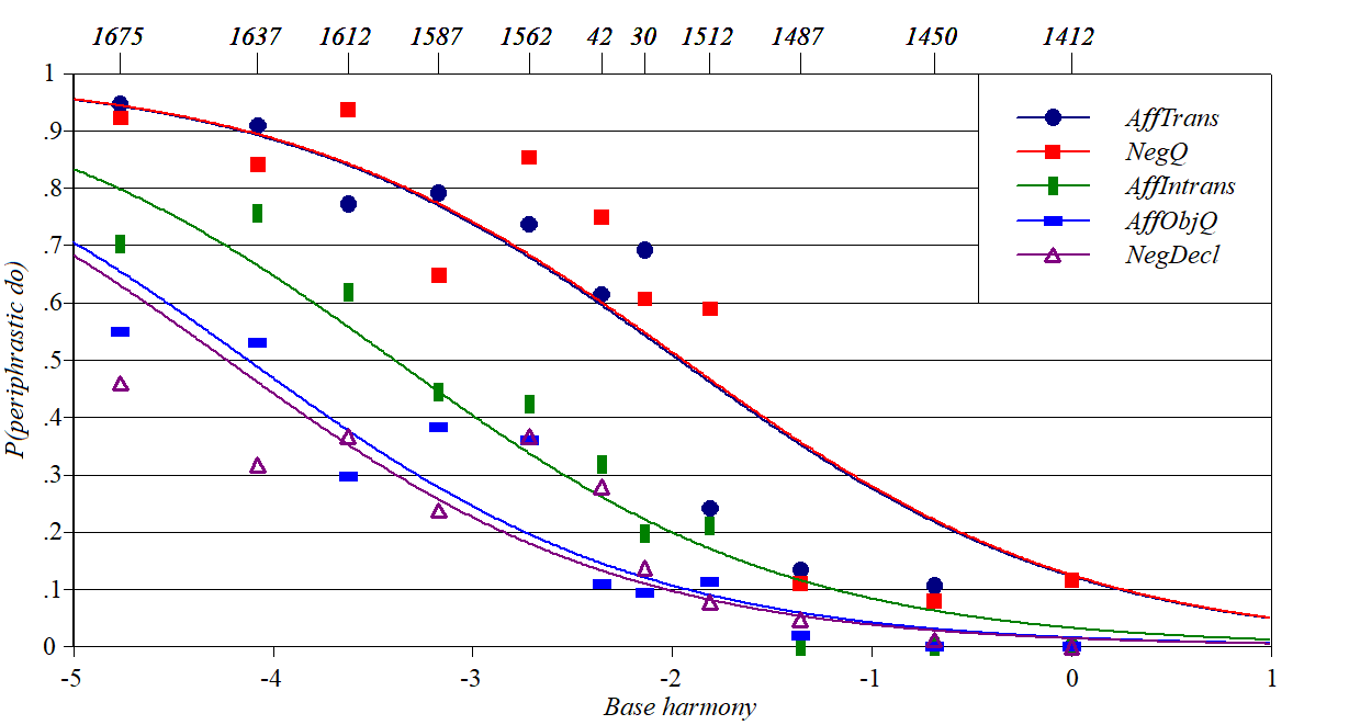
Periphrastic do
in English
Source Kroch
(1989), ultimately from Ellegard (1953).
Y-axis: probability of employing the inserted aux do.
Baseline constraints: a preference constraint shifting over time
Perturber constraints: governing various syntactic contexts. Spreadsheet, plotting
script
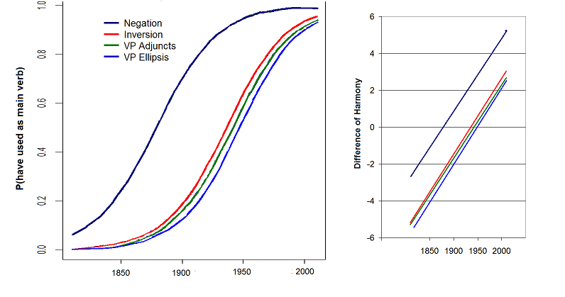
Evolution of have
from Aux to main verb in English
Source Zimmermann
(2017)
Y-axis: probability of employing have syntactically
as a main verb rather than as an Aux
Baseline constraint: a Aux-preferring constraint shifting over time
Perturber constraints: governing various distinct uses of auxiliary
verbs
Right graph plots same thing in different coordinates (harmony
difference), showing identical slopes
Wug-shaped
curves in semantics/pragmatics
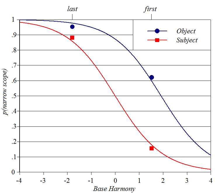
Quantifier
scope
Source: AnderBois
et al. (2012) Y-axis: probability subjects will
prefer narrow scope Baseline constraint: whether the
target quantifier is in first or second position Perturber constraint: whether the target quantifier is in subject or
object position Spreadsheet,
plotting script
Wug-shaped
curves in sound symbolism
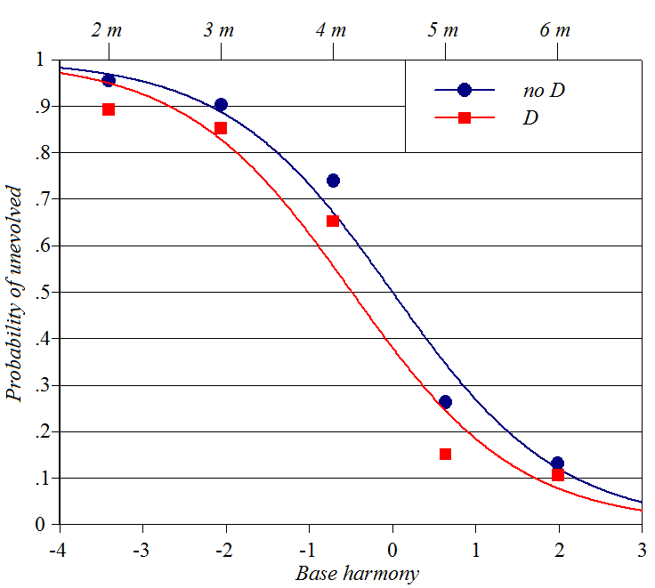
Classification of
Pokemon character names
Source (in this case, provides full analysis and discussion from a
wug-shaped point of view): Kawahara
(2020)
Y-axis: probability subjects will rate a Pokemon name as appropriate for
an "unevolved," smaller Pokemon creature
Baseline constraints: length of name in moras
Perturber constraints: whether name includes an initial voiced obstruent
(such as [d])
Spreadsheet (forthcoming), plotting
script
Graphs used
to diagnose theories
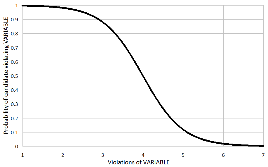
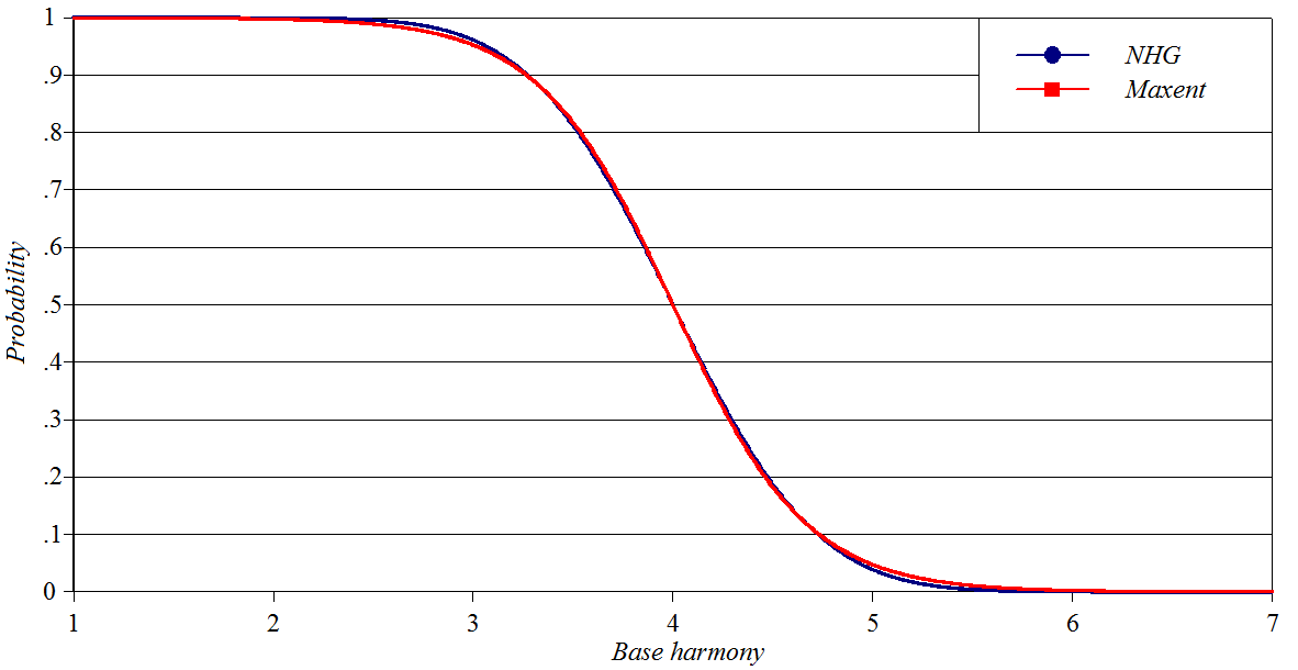
The MaxEnt sigmoid
This is discussed extensively in the main text of my
paper and is plotted here to permit the comparisons that follow.
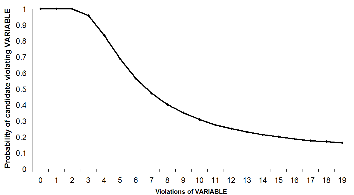
The asymmetrical sigmoid
of classical Noisy Harmonic Grammar
In
the
classical version of Noisy Harmonic Grammar (Boersma and Pater 2016), the
"noise" that makes the theory stochastic is added to the constraint
weights, prior to Harmony computation. This ends up producing a sigmoid
curve quite different from that of Maxent; it is asymmetrical, and the
long tail can be shown to asymptote to a value above zero.
The symmetrical,
oddly-similar sigmoid of late-noise Noisy Harmonic Grammar
If, in designing a Noisy Harmonic Grammar framework, you add the "noise"
to the completed Harmony values of candidates, you get a sigmoid that is
remarkably similar to the MaxEnt sigmoid (even though the math is
completely different). Here are the MaxEnt and late-noise Noisy Harmonic
Grammar sigmoids superposed, with constraint weights suitably scaled to
make the resemblance clear.
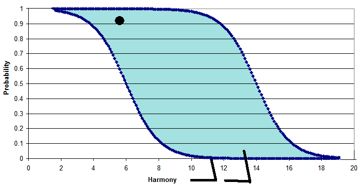
Can a wug-shaped curve
be fitted to any data?
Well, no; not under any sensible meaning of the word "fitted". For
instance, I opened up the spreadsheet for the Massaro-Cohen experiment
reported above and replaced the empirical
values from their experiment with random values. What happens is that the
best-fit MaxEnt weights came out very low, the scattergram of model fit
emerged as cloud-shaped, and the fitted sigmoids look like this:
The slope of the sigmoid ever-so-vaguely fits an entirely random minor
skewing of the data cloud, and the vertical arrangement of the sigmoids
fits the randomly imposed differences in the average values
for /r/ after different consonants.
So, no, good fit with wug-shaped curves doesn't come for free, it is a
contingent fact about the data. :=)
How I made
the curves
I'm sure there are better ways (for instance, R
is probably good) but this was the method I arrived at on an ad hoc basis.
You can see examples of how all this works if you will download the
spreadsheets and plotting scripts for individual cases above.
1. Obtain data. Some authors web-post their
data, other have the data printed in their article, and still others
give just a graph. Even with the latter, it is not hard to use Microsoft
Paint to get the values: look at the bottom of the screen for
vertical and horizontal coordinates of points in pixels. Hover over
the data points, and over the legend ticks, and put their values into a
spreadsheet. Then you can use arithmetic (or the handy Excel
FORECAST()
function) to convert pixels into real values.
2. If necessary, reduce data from individual tokens to
types-plus-counts. I do this by applying my little Typizer
program to the rows of a spreadsheet, read in plain text form, containing
just the constraint violations.
3. Do a MaxEnt analysis of the data, which is easily
done in spreadsheet form. The spreadsheets above show you do this;
it helps also to know the basics of MaxEnt; for which you can read my
paper. The key step requires you to deploy the Excel
Solver (which is free, but must be activated), in order to calculate
constraint weights. During this stage, you should calculate
Harmony in two columns, one for Baseline constraints and one for Perturber
constraints, then use their sum to give the overall Harmony from which
probabilities are calculated.
In doing the MaxEnt analysis, use this trick, assuming a particular input
has two candidates A and B: if Candidate B has one violation of
Constraint X, record the violation in the spreadsheet not as a 1 in the
Candidate B's row, but rather as a -1 in Candidate A's row. Then the B row
ends up blank, other than the crucial frequency value for B. The
math will come out the same, and it gives you the harmony values in
ways plottable as a single number, as described in the longer version of
my paper.
4. Collate the data, keeping only Candidate A for each
pair. I perform this collation with formulas in the space below the
main MaxEnt analysis. You must also collate the values for Observed
Frequency, Base Harmony, and Perturber Harmony. Optionally, you can
include data for Counts, if you'd like to plot as small the datapoints
that are not well-attested. It is also good to gather values for Predicted
Frequency; then you can make a scattergram with Observed against
Predicted, calculate correlation, and in general assess whether your
MaxEnt model is a good model.
5. Within the spreadsheet, fill in the necessary fields to make a
plot. These are shown in blue in the spreadsheets posted here,
and also can be seen in the downloadable plotting scripts.
6. Clip the blue material out of your spreadsheet and save it as
a text file, which is the plotting script.
7. Download my PlotSigmoids.exeprogram (Windows only, sorry!), put it in a new folder of your
choice, click on it, drag a plotting script file onto the designated
blank area of the interface. It will make a bmp image and put it into the
"out" subfolder.


![Wug shaped curve for Quebec French [l] deletion](Images/ImageForBaileyOnFrench.png)